Color theory isn’t just for designers. Understanding how colors interact has fundamentally changed how I approach every piece I create.
The Basics Worth Revisiting
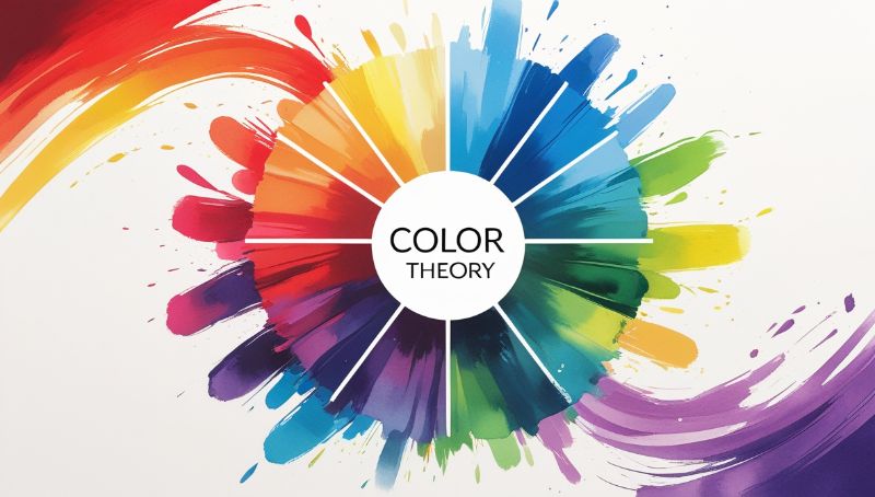
Even experienced artists benefit from returning to fundamentals. The color wheel, complementary colors, triadic harmonies — these aren’t rigid rules, they’re a vocabulary.
Complementary Colors
Colors opposite on the wheel create maximum contrast. Red and green. Blue and orange. Used thoughtfully, this contrast creates vibrancy. Used carelessly, it creates visual tension.
In my “Dreamscape Illustration,” the coral-blue contrast in the sky was intentional — it made the scene feel both dreamlike and slightly unsettling.
Temperature Changes Everything
Warm colors advance; cool colors recede. This is one of the most useful principles I use daily.
- Use warm tones to pull focal points forward
- Use cool shadows to push backgrounds back
- Shift temperature subtly to indicate light direction
Beyond Rules: Intuitive Color
After enough practice, color decisions become instinctive. You stop thinking “what’s the complementary color?” and start feeling “this needs more heat here.”
That intuition comes from thousands of hours of deliberate practice — and from breaking the rules once you understand them well enough to know which rules to break.
“Learn the rules like a pro, so you can break them like an artist.” — Picasso